Sometimes I’ll use this blog to cover MAME updates that have nothing to do with my work, especially if the developers involved don’t have their own pages to highlight the changes. The following post is one such example of this.
As well as the impressive netlist work done for Pong (and Pong Doubles) Couriersud (along with AWJ) also took a look at the palette handling in the earlier “nemesis.c” driver games from Konami, a bugbear in MAME for a number of users due to the poor colour reproduction we’ve had for a while.
Really old versions of MAME used some palette hacks, these were incorrect, andwere eventually dropped from MAME leading to rather washed out colours in the baseline build. These hacks were allowed to live on in MAMEFX based builds, but unless you wanted to risk use of an unofficial build you were stuck with with the bad colours or old versions.
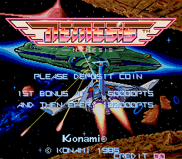
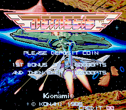
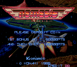
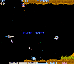
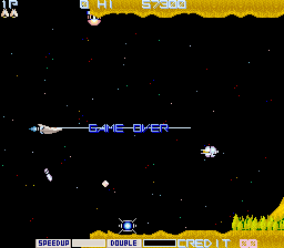
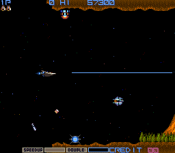
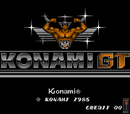
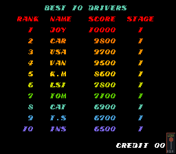
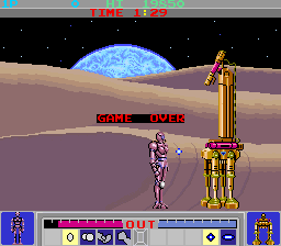
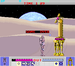
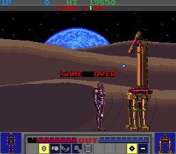
Correct colour reproduction in the driver benefited from Couriersud’s knowledge of discrete components, the actual PCBs used a rather odd setup resulting in an unusual gamma ramp for the colours. Working with AWJ this was correctly implemented in MAME, so all future versions will have correct colours again
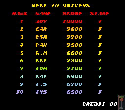
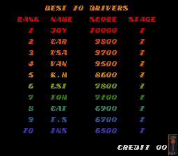
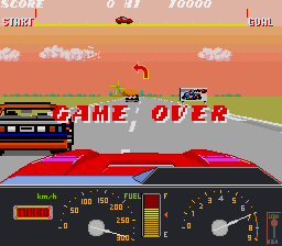
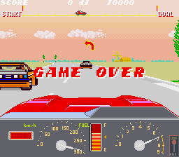
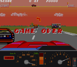
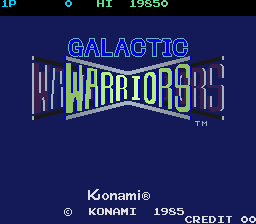
| Older MAME / MAMEUIFX (hacked colours) |
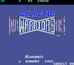
Current MAME (bad colours) |
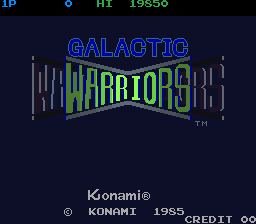
Next version of MAME (good colours) |
 |
 |
 |
 |
 |
 |
 |
 |
 |
 |
 |
 |
 |
 |
 |
 |
 |
 |
 |
 |
 |
 |
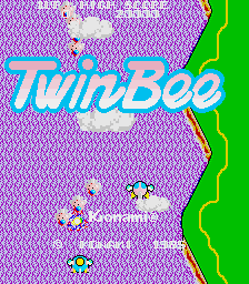 |
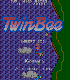 |
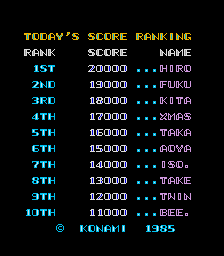 |
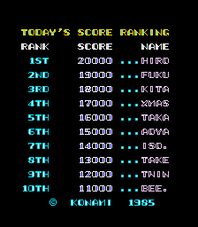 |
 |
I’m always glad to see things like this improving in MAME.
The other reason for doing this update is I’m wondering if anybody has a Final Star Force PCB and can record the attract mode intro sequence for me and maybe make some close-up shots of other areas? I’m 99% sure it’s wrong in MAME, but need to know what it should look like.
I don`t want to come over appearing as rude but can your eyes honestly say the `new` pictures are better than the 1s on the left¿?
I thought you were above hitching on the `Mame Knows Better` bandwagon. Why always lie¿? This is worse again you should use the MameUiFX code.
Thank you for showing me MameUiFx has the true correct colors, I will switch to this now and I`m sorry if this truth hurts you.
For my opinion… The 3rd one.
https://www.youtube.com/watch?v=Ud6wVbWNUH8
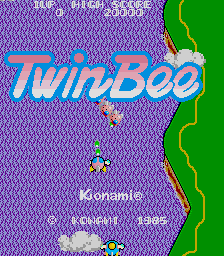
Don’t just look at the overall brightness (which you can adjust with the sliders in MAME) look at the contrast between the score/time display and the grey background behind it in Galactic Warriors, or between the score and the water in Twinbee.
Here’s an official Konami video from 1987 showing Twinbee:
http://nicoviewer.net/sm803537
You can see that on a real PCB the score digits contrast strongly with the water; in MAMEUIFX the water highlights are too bright and the digits blend in with them.
top work chaps, clearly the green letters in the galactic warriors logo plus the graphic of the planet earth look best in the ‘new’ colours. anyone who disagrees, either has some brain damage going on (eg. Tony) or probably grew up on mostly bootlegs and thus enjoy the washed out look.
Thanks devs u rock :)
Does this color fix also apply to the various Gradius revisions, too?
Sorry man but there is a noticeable difference between the 1st and third pictures… the 1st simply looks like the second but darker. In the 3rd the color gradations are better.
But that is irrelevant. Even if they looked identical, IDENTICAL I say, the 3rd would be better because it’s correctly implemented instead of hacked in, which means that the source can be used as a guide to show how the game worked and thus the game is actually preserved, not cheaply hacked to make playable, only to be unplayable again years later when your specialized build is abandoned and it will not longer run on current computer architecture.
I love seeing actual progress in MAME. This is great.
The colors look good to me. Tried out the wip from the newest MAME/MESS source SVN. :)
The palette hack in my build will go away. It’s still there by mistake. Since you have so much time to spend in using my full of hacks MAME version, you should have a look at the fuukifg3.c huge slowdowns on sprites which are not present in the real hardware but in official MAME.
Sorry, I’ve not been around for most of the weekend to reply to this.
Yes, I do think they look better, but there are a number of factors you should consider. First of all there is the CRT vs. modern screen issue, some modern screens have better colour reproduction than others especially on darker colours I’ve found.
Out of all the new shots the only one I don’t like as much is the Konami GT ingame one, the sky colour is a little too intense for my liking, but that’s just how it is.
I think as more circuits along these lines are emulated it might become a bit like the ‘game volume’ issue some people have with MAME, where some games are significantly louder / quieter than other games if you attempt to run a multi-game setup, but again this is just how things were.
I’m looking for FINAL Star Force, not Star Force.
Very sorry.
There is one user can repair PCB Boards.
You can ask him, and maybe he can find it, and give you a video post on youtube.
https://www.youtube.com/user/lukemorse1
Good Luck Haze.
This reminds me of the discrepancy in color brightness that used to happen with some Mega Drive emulators (because some rounded the maximum values to 255 and some didn’t), or the really big color differences in some Spectrum emulators.
…Which also makes me wonder if there’s other games in MAME or systems in MESS that have their brightness manually altered so they look “better”.
There are probably a few.. I know old versions used to boost the colours in Data East’s Edward Randy, but it’s a fairly common Data East PCB setup, so it seems more likely it just has a rather dark output.
I’d imagine there are a fair few older PCBs with additional logic to the colour generation tho, just like there are plenty with audio filtering circuits.
Something seems a little off in the new colors, but they are definitely better.
Best way to A/B this is to hook the PC up to Jamma, and verify the colors when hooked to the same monitor as the jamma board was. the colors seem too dark to me, and pure white seems dim especially. was it really that dark?
The “master” volume not being saved in the game .cfg file is a bit of an annoyance. Being able to alter the levels of different channels from the sound chip wasn’t done on actual hardware, but it’s there in MAME!
The gamma slider saves into the .cfg (which is fantastic – I’ve been using this for Nemesis for a while now and get very similar results to image 3, but not the volume slider…
Personal tip – set gamma in mame.ini to 0.7
Exactly. For years I thought the Nemesis title screen was poorly drawn, but it actually looks decent when the colors are accurately reproduced. And the color saturation is *much* better with the fixes than in the first two columns.
I can’t speak for these games specifically, but when I stumbled across some old arcade cabinets of games that I used to play, some of the games certainly looked darker than my rose-colored memories. Of course it could just be that the monitors were dying…
But memory is a fickle thing. There are also games that I remember as looking better than they actually did.
I can also say that I didn’t remember my PS2 outputting such dark images. I fired it up a while back, and it was so dark that I wondered if the video was going out on the machine. I looked online and found that yes, PS2 hardware did output dark video (which PS2 emulators don’t copy). I’d just gotten used to it during the years of playing the system, so it was a shock coming back years later and seeing just how extreme it was.
Ed Randy reminds me my PCB with Superior Soldiers (probably world version not in mame). This is the only one pcb that i have with really dark picture. I assume it outputs 0,7 V instead 1V and resistors placed in Vogatek supergun are not needed in this case. Or it might be damaged :/ Also my Violent Storm EAC has a bit darker colours when I compare real PCB and picture that came from MAME to my TV. I must try run this game on TV and rise a bit contrast
Nemesis at 0.25 gamma pre-driver-changes looks the same as the shots taken above!
Beautiful. The new shots of Nemesis take me right back to the old video shop where I used to play it. My nostalgia gland telling me that it’s bang on. After all the years that have passed and exposure to the game in many different ports and versions, I’m just glad that part of me is still functioning :)
Yeah, brightness can be turned up and down, but in the new shot the surface of the enemy ship looks more curved, the glows look more glowy, etc.
Really happy that the game looks just like I remember it, now – thanks.
Don’t know if this is a MME MAME problem or a bug when you shoot multiple enemies in nemesis the sound sounds all garbled reverted back to earlier build of mame and it is fine “WEIRD”