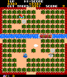
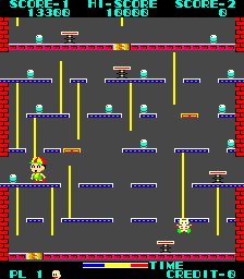
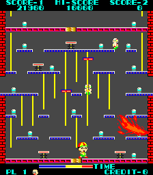
Logger is a terrible Donkey Kong rip-off. If the horrible controls don’t put you off (up moves you forward) The even worse collision detection might, the broken jumping mechanics will push you in that direction, the anaemic implementation of Donkey Kong play mechanics are unforgivable, the music offensive to the ears; there’s really nothing at all good to be said about Logger.
If revision labels are to be believed however, Logger actually looked a bit LESS like Donkey Kong in an earlier revision. It still played the same old terrible game, but it looked a bit different. Andrew Welburn and Craig Anstett provided what is meant to be Logger ‘Revision 2’ while the one already in MAME is said to be Revision 3. Here are some screenshots with the newly dumped Revision 2 on the left and the existing Revision 3 on the right
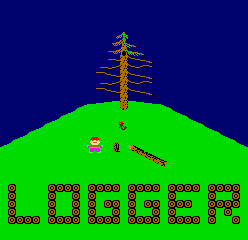
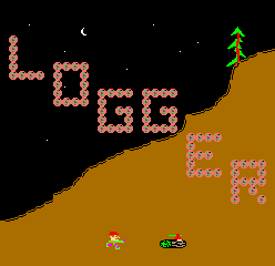
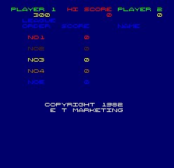
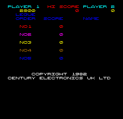
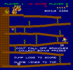
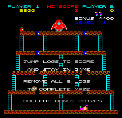
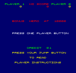
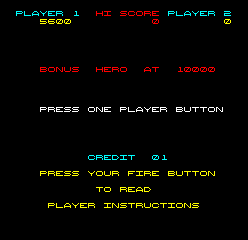
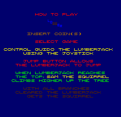
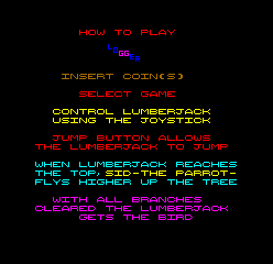
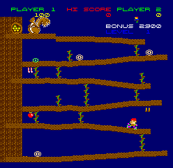

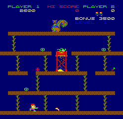

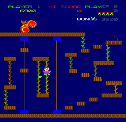
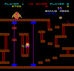
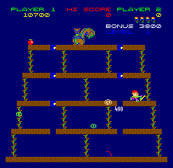
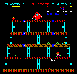
So.. yes, the graphics were redrawn between revisions. I guess it’s important to note that Revision 2 shows an ‘E T Marketing’ copyright while Revision 3 shows the Century, the expected copyright, so it’s possible the changes were down to E T Marketing rather than the revision, but if you look carefully at Revision 3 you’ll see a few graphics that still seem to fit better with Revision 2; the leaf on the 3rd stage for example.
Other than that the Revision 2 set is noteworthy because it uses the traditional Donkey Kong girder level as the gameplay demo, while the Century set uses the 4th and final stage as the demo, which for a newer revision is a little odd because you don’t actually get to play that stage until last, making those attract instructions almost useless for somebody who hasn’t played before.
The Revision 3 set has additional animations, such as the bird flying off and falling down after the 4th stage, Revision 2 has no such animations.
Strangely Revision 2 more correctly refers to the player button as the ‘Jump’ button while Revision 3 calls it the ‘Fire’ button. Revision 3 also re-adds the first incomplete ladder to the girder stage after Revision 2 didn’t bother to copy that from Donkey Kong.
It’s also worth mentioning that the ladder graphics used in Revision 3 do actually appear to be in Revision 2, just unused; the entire reason the platforms are sightly different angles in Revision 2 is that while the Ladder graphics appear to have partial tiles for each of the 8 possible lengths a ladder could be within a tile, while the vine graphics do no, there’s only a single 8×8 tile so everything must be on 8×8 boundaries. It seems like the Donkey Kong ladder theme was actually developed first, but then not used until later? Revision 1 might be interesting if it ever shows up.
Some of the palettes are ugly on both sets, especially the large Crow / Squirrel graphics, but I imagine that’s just how things are.
Let’s be fair, neither of these is worth playing, but it’s great to see them documented as it shows the influence Donkey Kong had on gaming at the time and how others tried to cash in on the success of that game in completely shameless ways.
